
Revisiting this Portfolio Site with Svelte 5 and Skeleton UI
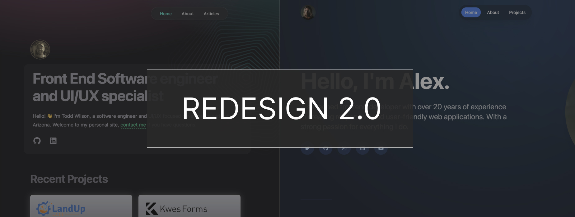
Lift and Shift
It’s been a while since I’ve revisited this idea and it comes just in time to leverage Sveltekit 5 and the latest Skeleton v3 Beta. This time around I simply just started a new project and selected a theme that I found inspiring.
The original idea was to keep it mainly a single-page focus but this time I want to split up the pages from the home page content. Projects will get their own route and I can consolidate the “about” page to the home page.
Pro tip: During this site development, I was evaluating the Codeium Windsurf editor. I highly recommend picking this editor or similar, it will help accelerate your development process.
Theme System
Using the Skeleton theme system and applied the wintry theme. Then I started to build out the components and file structure as I started on the layout.
I found by using the built-in theme variables and classes that it was much easier to style the layout the way I wanted. As I worked down the page, I pulled in the related Skeleton components. I like how the documentation was organized and made it easy having some built-in svelte examples.
Pro Tip: If you aren’t sure on how to start building out your components, I recommend looking at some open-source projects that use the same version / framework as you are using. I used themes.skeleton.dev for how the components were organized.
Harness Tailwind Plugins & Configuration
There are some baseline configurations that every TailwindCSS site must define or use the defaults therein. The font headings, screen sizes, theme and plugins are naturally the central focus.
I find that by starting with this configuration you can really avoid from having to add a lot of extensive CSS in redefining what this framework has built-in for you.
Here are the plugins I defined with the theme:
plugins: [
    forms,
    typography,
    skeleton({
        // NOTE: each theme included will be added to your CSS bundle
        themes: [themes.wintry]
    })
]
One of my first steps is to define all the font family and vertical rhythm for the layout. In this project, I downloaded the variable font (Inter) from google fonts and saved it locally in my project. This way, I can serve up only the font weights I need and don’t have to rely on the CDN to load them.
Broken forms
When I started this project, I found my form was throwing an error. The hardest part of this step is offering a lead form to users but also enabling spam tools around it. Aside from that, having good looking design layouts to base the project from is also a challenge. For this project, I used Clonify sections with Figma then had some of those produced using the Figma Builder.io Plugin.
Here’s the section I chose to customize, I liked the heading style and dark form layout (builder.io preview):
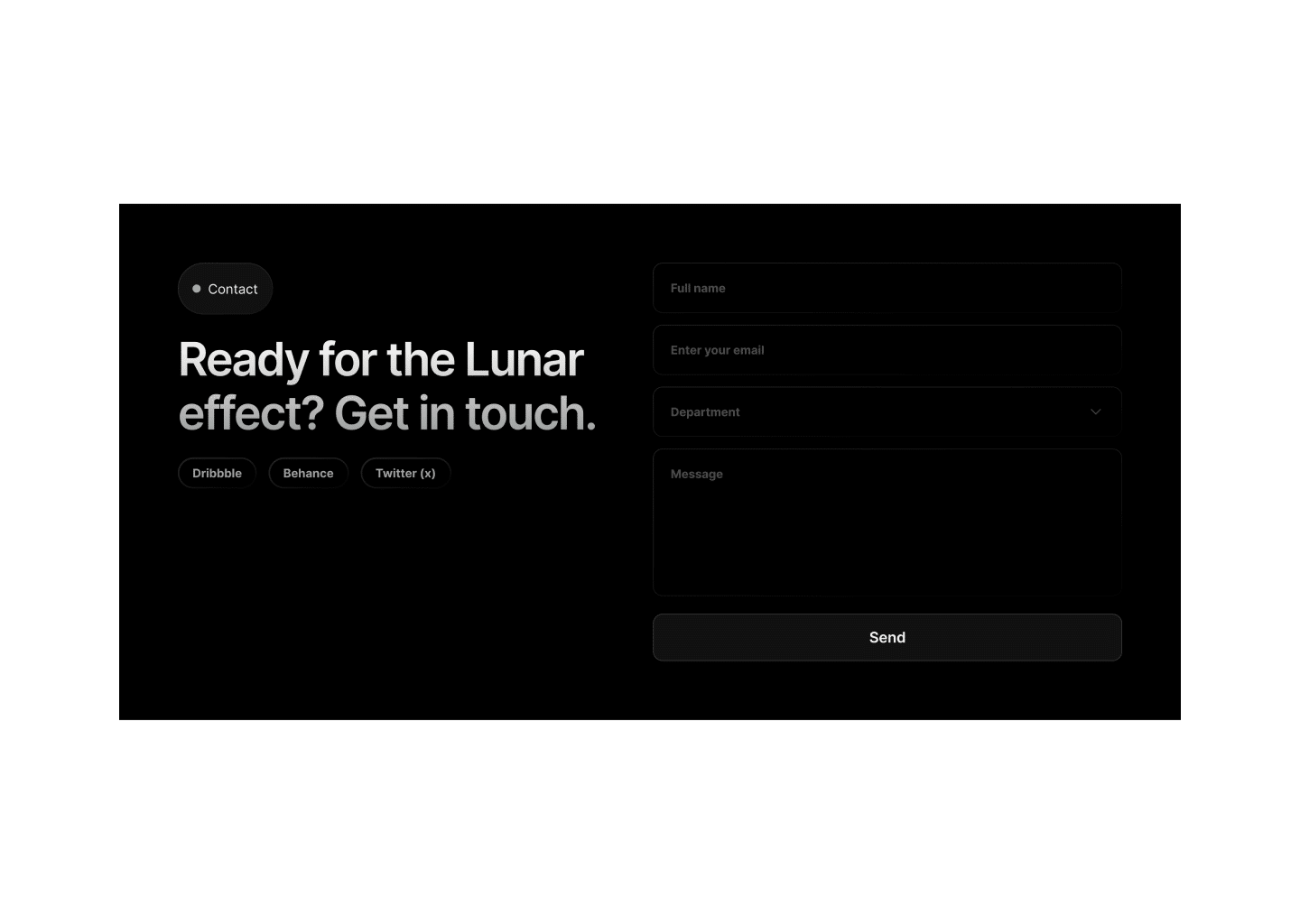
For the form processing and user interactions, I used a modal to show when the form succeeded which makes it easier to handle than redirecting the user. For the form service, I went with Formbold and you can start with their Free tier and move to something more scalable, as you go.
Pro Tip: Be sure to spend a few minutes setting up the “Custom reCAPTCHA” settings and use the v2 or it won’t work. In my opinion, this is a good first step for any form you set up.
That’s a wrap! I hope you enjoyed this post and if you found it useful be sure to share it with a friend and subscribe to my newsletter to get more helpful tips like these.